Too bad there are a lot of idiots in this world - starting with myself - who don't have the slightest clue on how to use it. I mean, I always loved photography and as a kid I used to play with my grandfather's "borrowed" old Zenit camera, but since photographic films were not cheap and I had no means of editing the photos, I quit. Since then, I've been planning... and planning to get a camera of my own, but since I don't want anything below a SLR - and a decent one is around 1,000 EUR - it'll have to wait. But that's another story...
Getting back to Gimp. My concrete problem was how to get two images of exact size (after adjusting their size such that they "fitted" the dimensions) overlap with an amount of transparency. I'm aware this must be an extremely easy task for anyone just a little bit more photo editing savvy than myself, but anyways - I had no clue what to do so after googling and reading a little bit, I found out.
I'm posting here the "short version", suitable for my concrete issue. (Such that I'll know next time where exactly to go to for instructions.)
Step 1. Get two images and, after making the suitable adjustments for each of them, be sure they have the same width and height. Have both of them opened in Gimp.
In my case, here's where I started from:
The first image:

and the second one:

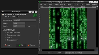
Step 2. Select the image that will be the "base" one, i.e. the one you want as, say, "background". (In my case, this was the "Matrix" picture.) Next, select "Layer" -> "New Layer...", then give the new layer a name and select "Transparency" in the "Layer Fill Type" section.

Step 3. Naturally, now that you've created the new layer on the base image, you want to paste onto it the overlapping photo. To do this, go to the second photo and copy it ("Edit" -> "Copy") and then come back to the base image and paste it on the new layer ("Edit" -> "Paste").
Step 4. Now you've got the "top" photo over the "base" photo, in a separate layer. The problem is you can't do much on this second layer because, erm, well, it's "floating". You have to make it stay still :-) Go to the "Layer" menu and select "Anchor Layer" from there.
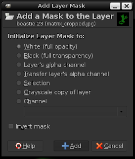
Step 5. Next, you need to add to your overlay ("top") layer what is known as a layer mask. To do this, select from the "Layer" menu "Mask" -> "Add Layer Mask..." and from the options present there, pick "White (full opacity)".

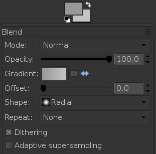
Step 6. Next, you need a gradient on this layer mask in order to "make" the transition between the two images. From Gimp's main window, select from the toolbox the Gradient tool ("Blend tool"). For the purpose of this particular blending, I chose a radial gradient, from light gray to an even lighter gray. The selected fill options are the same as in the image below:

Step 7. Now it's time to actually apply the gradient on the mask layer. I chose to drag a diagonal line in order to apply the radial gradient (such that the radial gradient could cover all the picture). Just drag a line (with the gradient tool selected) on the mask layer, from, say, the upper left corner to the lower right corner.
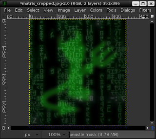
Step 8. Voilà. The gradient is now applied and the two images should be present in a "blend". The result should be something similar to the picture below:

Step 9. If you're not satisfied with the results, you can tweak various parameters and repeat Step 6. and Step 7. until you get to like the final result.
Step 10. In order to be able to save the resulted picture in an usable image format, you must have only one layer; that is, you need to "flatten the layers" present in the picture. From the "Image" menu, pick "Flatten Image".
Step 11. Now you're ready to save your new picture. Choose "File" -> "Save As..." and set a file name for your picture. (Just make sure you pick "Save As..." instead of "Save", otherwise you'd end up overwriting your original "base" image - in my case, the "Matrix" one.)
I don't know if anyone might find this useful, but as for myself, it's certainly a good idea to keep a good account of new learned "skillz". :-)
It's very informative.Thanks for posting.
ReplyDeletethanks, very useful :)
ReplyDeleteOh my gosh, this is the BEST ONE I HAVE EVER SEEN!!! Thank you so much! It is very clear and awesome!!!
ReplyDeleteExactly what I am looking for! Great work!
ReplyDeleteWicked thankyou so good info keep on posting...
ReplyDeleteI was looking for how to do that. Your explanations are very clear and the best I have seen. Thanks a lot!
ReplyDeleteSo useful! Thank you for posting :)
ReplyDeletethanks a lot for this clarity
ReplyDeletebut I had a problem when I did it: my background image is green, and my foreground one is red (in biology, we have different fluorescence colors..), so the resulting image is yellow where the 2 colors superimpose. Can't I get rid of this problem? I need both colors to be still independent not merged..
thanks in advance :)
OMF'nG, YES! I wish I had found your blog days ago. I sometimes find the best way to learn these programs are to just spend time tweaking around, over and over. But in this case, I could not ascertain a quick way to overlay one image on top of another without taking a crash course in greek. Thank You, Thank You!!
ReplyDeleteThanks for sharing. It was really helpful step by step. Easy to follow.
ReplyDeleteThank you for this. So simple and much easier than those you tube instruction videos.
ReplyDeleteThank you! It really helped me! :D
ReplyDeleteOMG it actually worked!!!! You made it so simple, thankyou thankyou thankyou!!!
ReplyDeleteI've been wanting to do this for a LONG time. You guide made it simple to do! Thanks!
ReplyDeleteme no understand
ReplyDeleteThis is literally by far the only helpful tutorial I have ever encountered about gimp. All the other instructions I found were so useless you wonder if the person posting them based them on using different sites. Thanks so much for providing real concrete assistance.
ReplyDeletePaint.net is (at least in our opinion) the simplest option on the list. It still comes with a ton of powerful features like layers, adjustments, and user-created plugins, but is simple enough that complete newcomers can grasp it immediately. The features are across the top, and filters are accessible from a drop-down menu.
ReplyDeleteSome of the special effects are pretty cool: sharpen, blur, distort, emboss, etc. You can even get some Instagram-esque vintage effects in there for good measure. We don’t want to waste too much time on this one. It’s got a lot of features, an easy interface, and a simple layout. If you’re struggling with others on this list, then stick with the easiest option.
VSCO (Android &iOS)
ReplyDeleteA hugely popular photo editing app amongst Instagram users, VSCO is more than just photo editing, it offers a community for photographers to connect and create. Simply searching the Hashtag #VSCO on Instagram will reveal the huge community of photographers and casual users that use VSCO every day, a testament to the app’s popularity.
VSCO houses all the tools you’d expect from a favourable photo editing app; saturation, highlights, temperature and vignette can all be adjusted alongside many other settings. VSCO also offers a built in camera with advanced controls, allowing you to capture the perfect shot, edit and save, all without leaving the app, an A for convenience. Filters are also a huge feature for VSCO, with the option to buy filter packs each with their own distinctive styles and tones, very popular amongst users of the app.